top of page
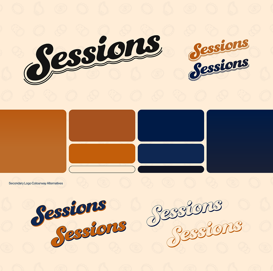
Sessions
A redesign focused on repositioning Sessions to be seen as the local's local, a community go-to and as the brief stated,
'the place to go to stock up before having a great Sesh with your mates'.
The brand wanted to be more youthful to better reflect its new brand strategy, the resulting work focuses on expression and taps into the new generation's rejection of corporate, millennial branding where cleanliness and minimalism is the driving technique. Instilling a feeling of mateship, the rebrand creates a aesthetic with character, using a heavy-weight retro style font with custom typographic work to modernise the wordmark and tie it back to the brand's industry.


bottom of page